
Footer Always at the Bottom – Flexbox
When a web page doesn't have enough content to fit the screen, the footer doesn't stay at the bottom so it ends up looking weird. Solution: Do the layout using flex columns. In addtion to that either, add flex-grow: 1 to the content area, here it is the section. Or add margin-top: auto to the element you you wish for it to always stay at the bottom, here it is footer.

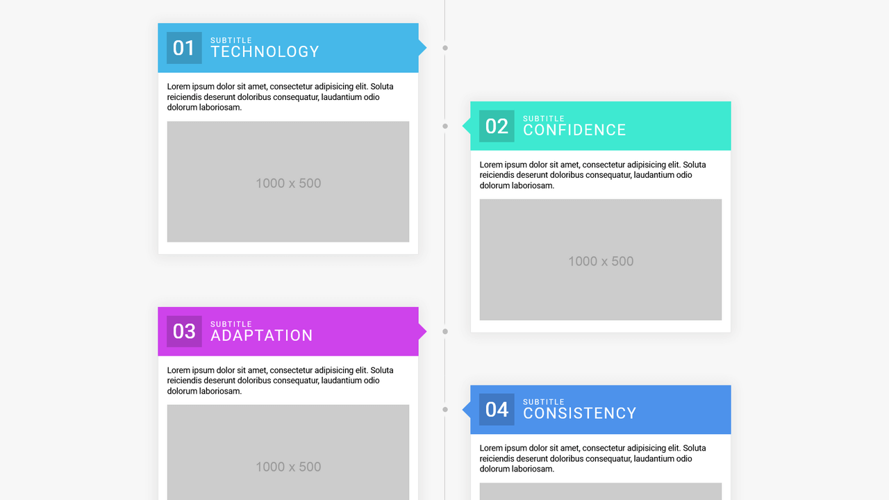
Flexbox Timeline Layout
Column-based flexbox timeline layout. The goal is to have clean, semantic HTML while creating a (somewhat complex) timeline-looking layout.

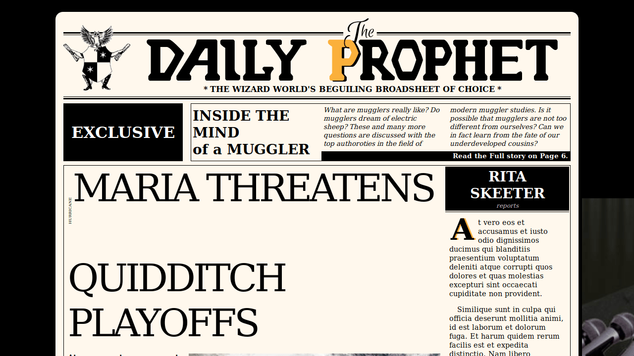

Responsive Comic Book Layout
A responsive layout using flexbox with narrative text and speech bubbles styled in CSS. Background patterns also in CSS. The only acceptable use of Comic Sans font.

Webflow-Style Email Input
Based on the input on https://webflow.com/cms. Changed to make use of pseudo elements and flexbox layout.
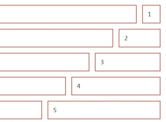
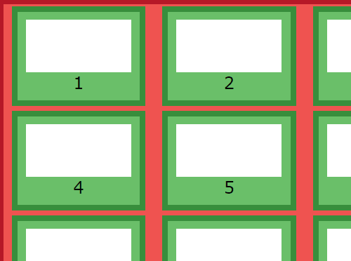
strawberry
Yet another small CSS framework that helps developers and beginners to quickly create fully responsive, nested grid layouts using CSS flexbox model.

align.css
Align.css is a pure CSS library which can be used to align elements inside a container element using CSS Flexible Box Layout.


atomic-bulldog-grid
Atomic Bulldog Grid is a CSS(SCSS) library to generate modern, responsive, flexible grid layout using the CSS Grid Layout technology. The library also provides a fallback that uses CSS flexbox.

griddd
Griddd is a lightweight, responsive, CSS flexbox based grid layout that is fully customizable via SASS.


fukol-grids
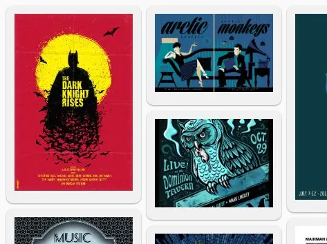
Fukol(tm) is a tiny (less than 1kb), extendable, fully responsive, Flexbox based, progressive enhancement CSS grid responsive for modern web design.

infinity-css-grid
infinity-css-grid is an ultralight (less than 0.1kb ) CSS layout system that helps web developers quickly generate responsive, flexible grid layout using CSS flexbox.
Flex-One
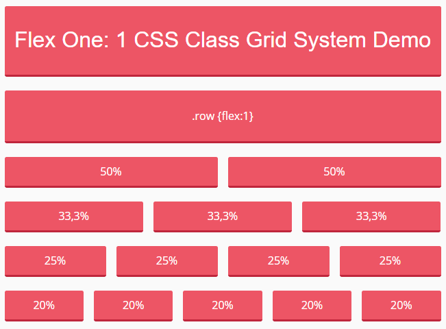
Flex One is a dead simple CSS class to create infinite responsive grid systems based on CSS flexbox layout.

hstack-vstack-css
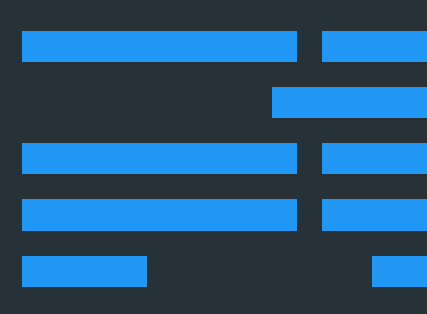
CSS layout components that (basically) horizontally and vertically stack anything.
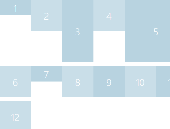

csslayout
The csslayout project provides a collection of 70+ commonly used layouts, components, and patterns for the modern web & mobile design.

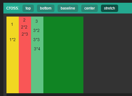
flex.css
flex.css is declarative layout which is compatible with wechat, UC, webview and other main-stream mobile browser and surpports react, vue, angular.

Simple-Masonry-Flexbox-Vanilla-JS
A lightweight Vanilla JS library to help you generate a responsive, mobile-friendly Masonry grid layout using CSS flexbox.
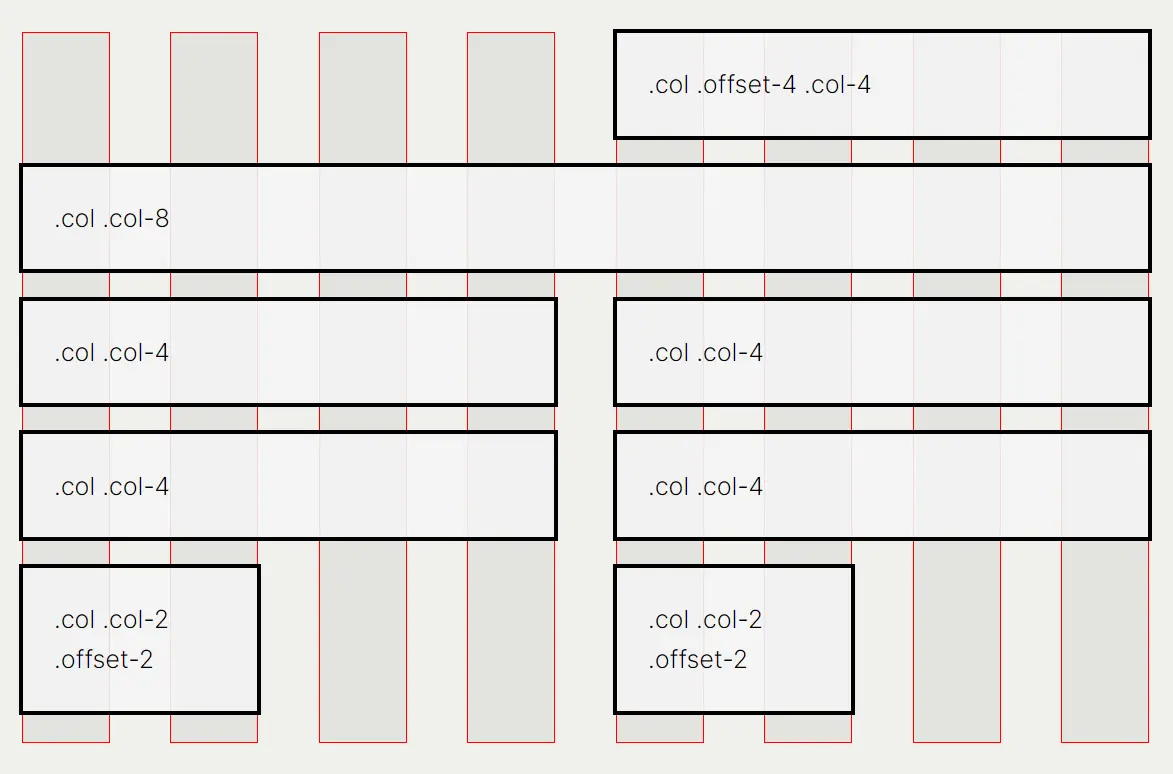
CSSColumnPro
The lightweight alternative to a bootstrap grid system. Tired of importing entire frameworks for an effective grid system? Try using CSS Column Pro for a reliable lightweight CSS Grid System.
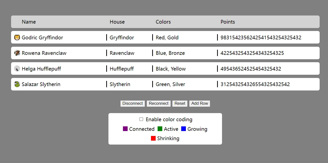
columns-resize
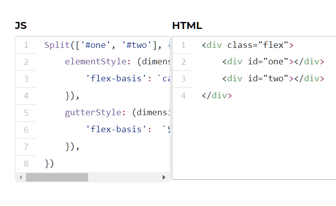
columns-resize is a JavaScript library to help create table-like, multi-column, and resizable web layouts using CSS Flexbox.

jquery-same-height
There are many ways today to solve for equal height elements on modern web development. The best two ways are to use CSS flexbox and Grid Layout.