
Perspective Grid with Animation
This gallery utilizes CSS Grid Layout and CSS3 perspective to create something a little unique.

css-grid-12-column-layout
https://erikmonjas.github.io/css-grid-12-column-layout/ 12 column grid using display:grid. It includes the necessary prefixes to work in Internet Explorer.
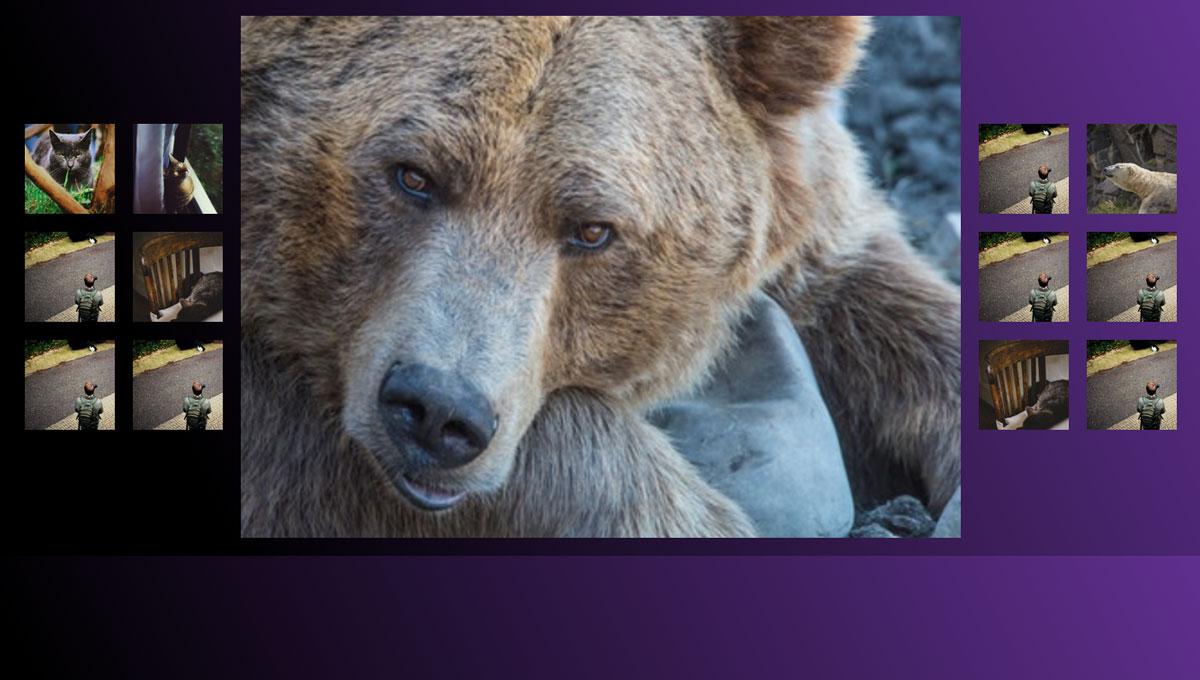
Responsive Pure CSS Image Gallery with CSS Grid
Here's one of an image gallery where you select the img you want to be showcased in the center. The layout is made possible with CSS grid. When switching to a smaller viewport you'll get a different experience that is made possible by altering the grid-template-columns and grid-template-rows.

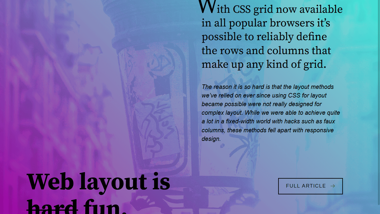
Web-Safe Magazine Layout
A full-page responsive design utilizing CSS Grid. Full-bleed images and columns give the page a magazine-like feel.
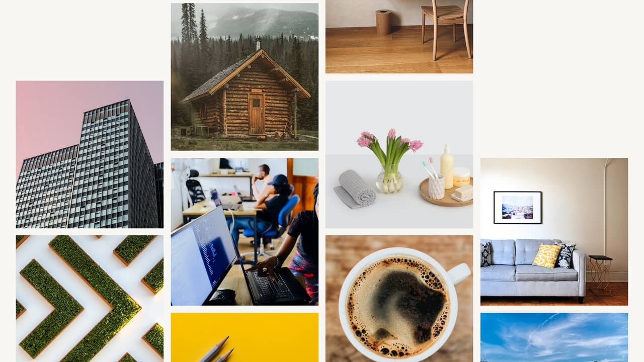
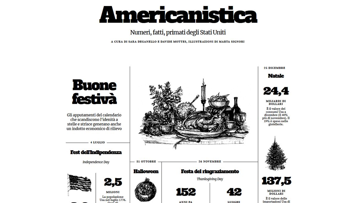
Print Layout From The Intelligent Lifestyle Magazine #2
Recreation of a print layout from The Intelligent Lifestyle Magazine book using CSS Grid.
Print Layout From The Intelligent Lifestyle Magazine #1
Recreation of a print layout from The Intelligent Lifestyle Magazine book using CSS Grid.
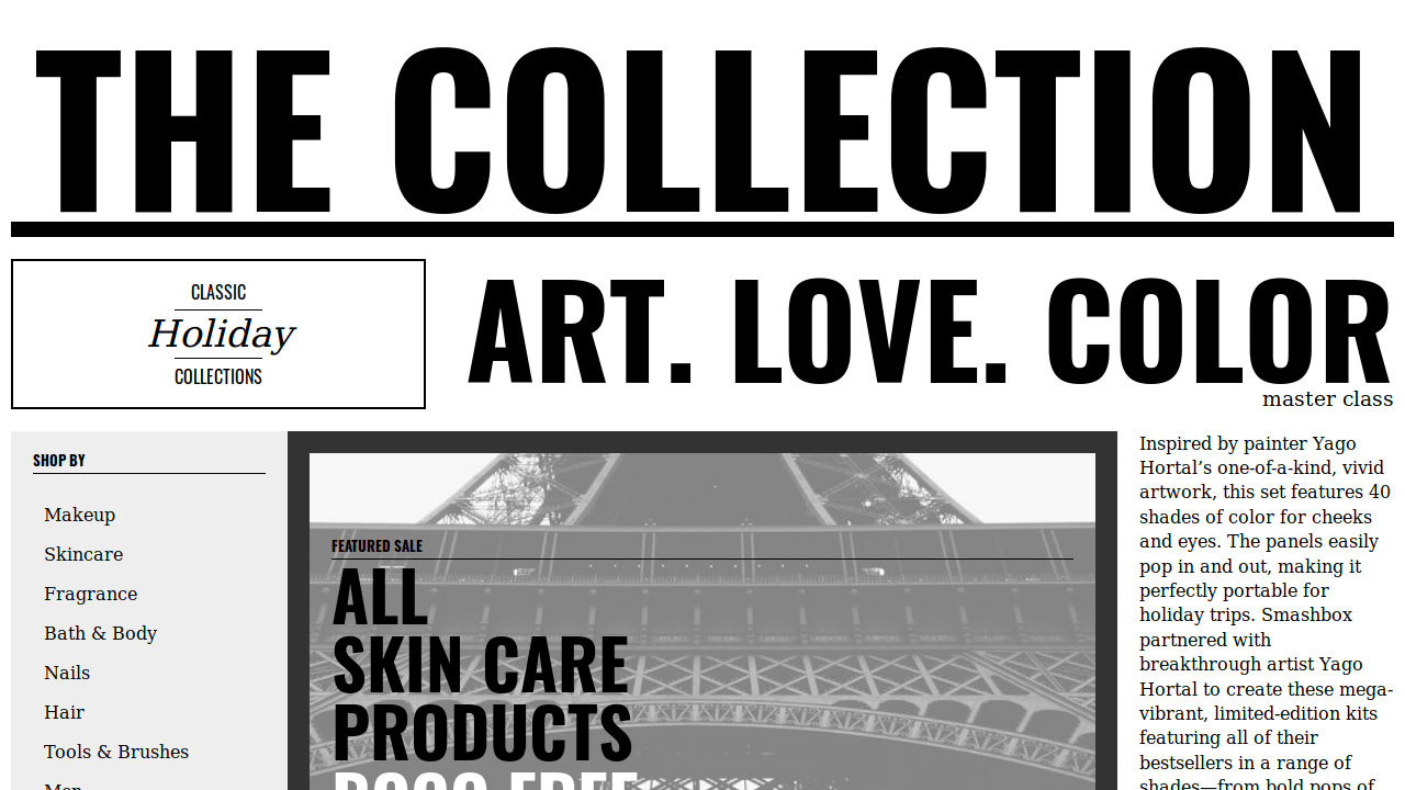
Grid Experiment No. 3
Recreation of a print layout from "The Intelligent Lifestyle Magazine" book using CSS grid.


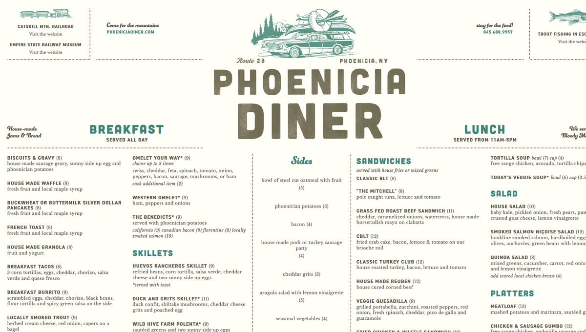
Grid Experiment No. 4
Recreation of a print menu from "The Phoenicia Diner in Phoenicia", NY using CSS grid.
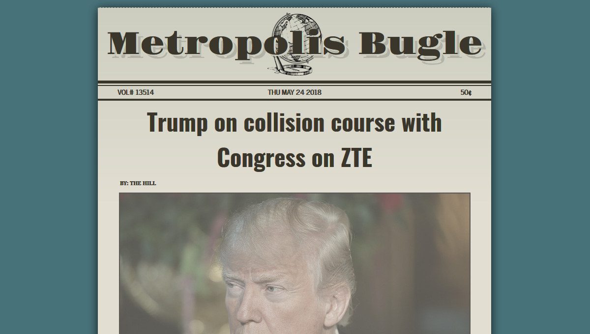
Dynamic Newspaper w/CSS Grid
Automatically loads latest stories on refresh. Layout is done with CSS Grid. Built with HTML5, CSS3, JavaScript, jQuery and the News API.
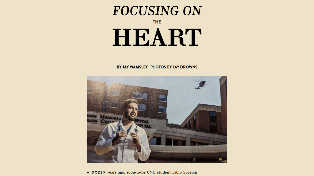
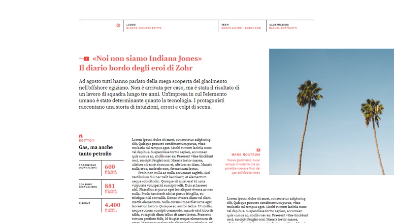
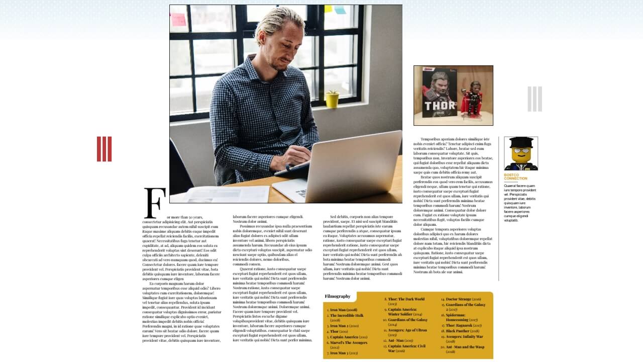
Responsive CSS Grid Magazine Layout – 1
Responsive magazine layout using CSS Grid. Best viewed at 1280px.
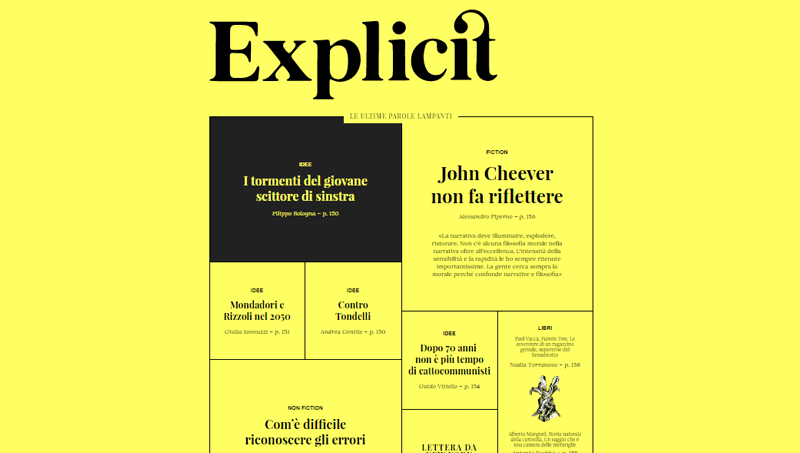
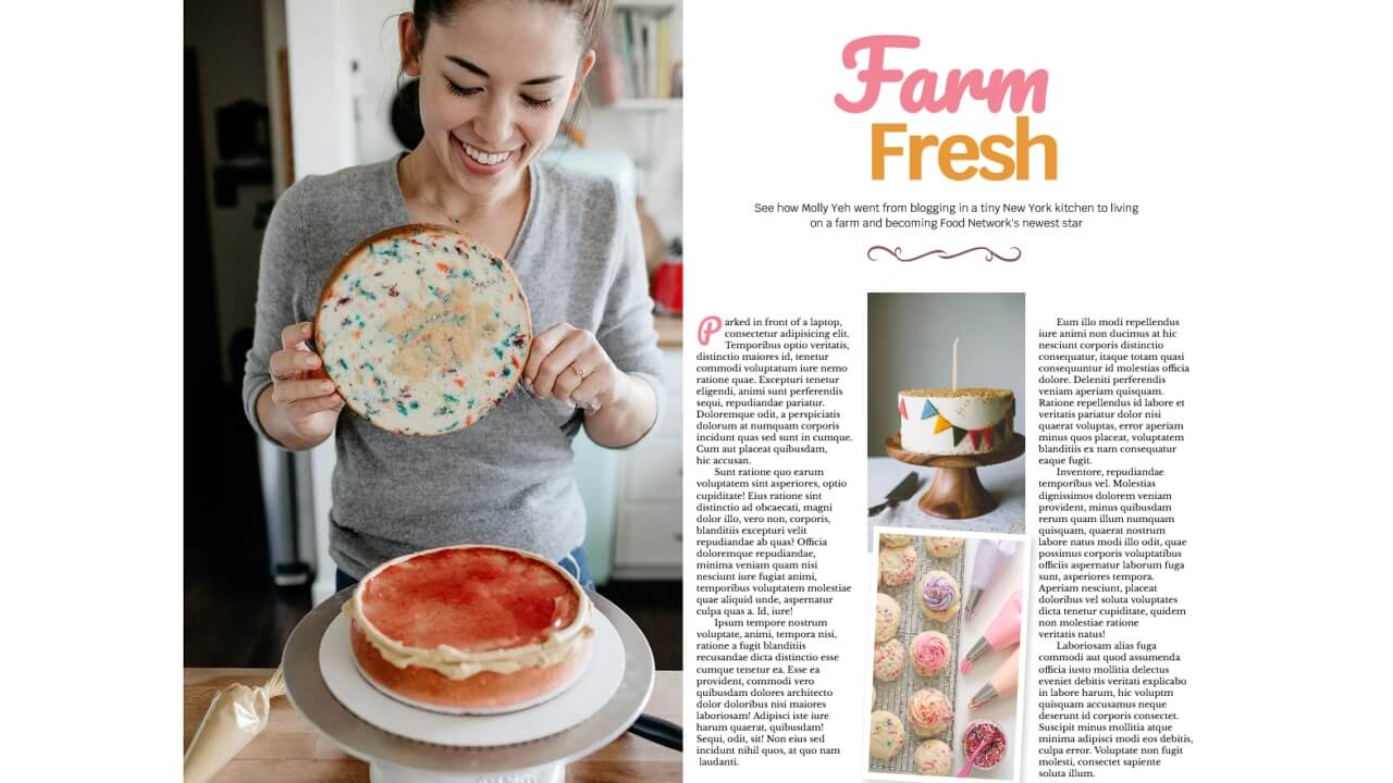
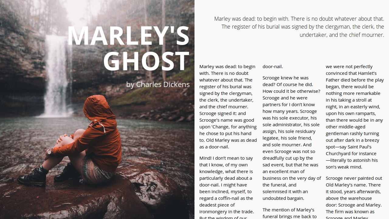
Responsive CSS Grid Magazine Layout – 2
Responsive magazine layout using CSS Grid. Best viewed at 1280px.


ungrid
ungrid.css is a super tiny CSS library that helps you create responsive, smart, fluid grid system with ease. Both fixed and percentage base widths work perfectly. You can even use them together. The remaining columns will take up the rest of the available space.
strawberry
Yet another small CSS framework that helps developers and beginners to quickly create fully responsive, nested grid layouts using CSS flexbox model.

InContent
InContent is a pure CSS grid layout built with LESS/SASS for creating a responsive & animated image grid gallery that comes with lots of CSS3 based image caption hover effects like rotate, flip, slide, etc. It currently works perfectly on modern browsers that supports CSS3 transition and transform properties.
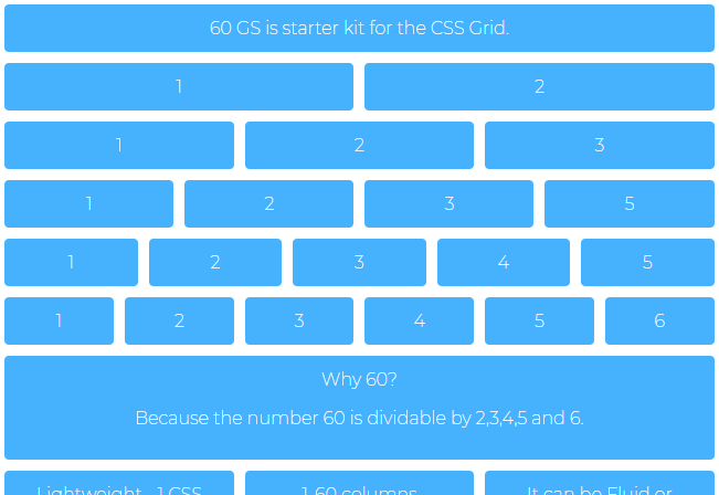
60gs
The 60gs.css library lets you create 60 columns grid system based on the CSS Grid Layout.