Footer Always at the Bottom – Flexbox
When a web page doesn't have enough content to fit the screen, the footer doesn't stay at the bottom so it ends up looking weird. Solution: Do the layout using flex columns. In addtion to that either, add flex-grow: 1 to the content area, here it is the section. Or add margin-top: auto to the element you you wish for it to always stay at the bottom, here it is footer.

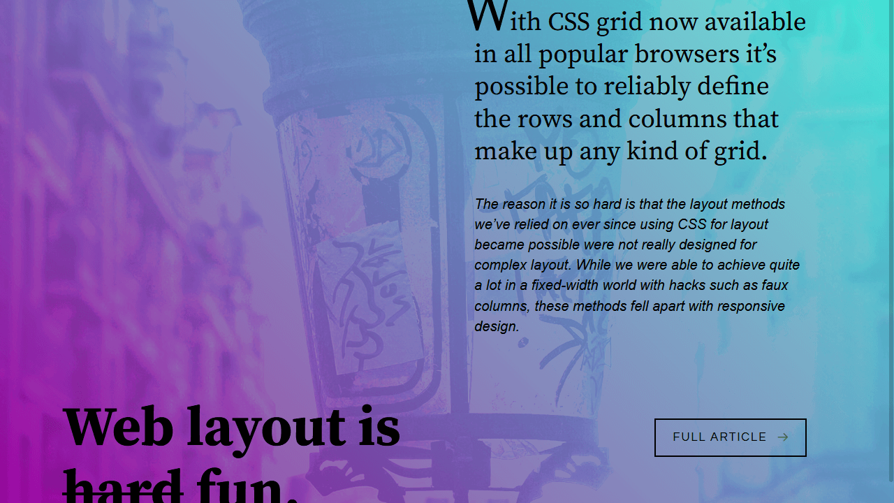
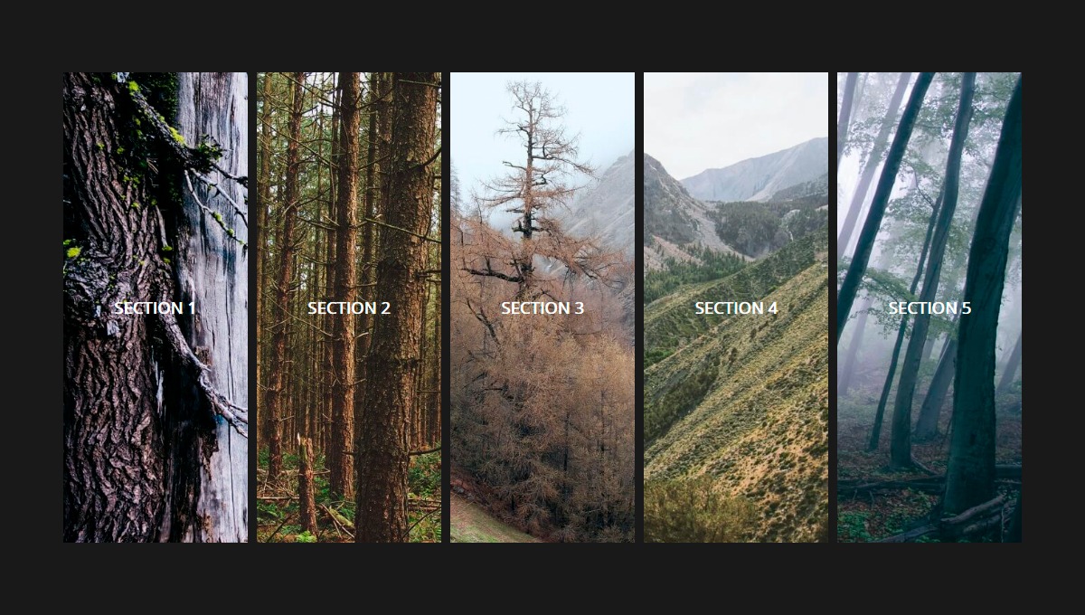
Cool Layout with Complex Chainable Animation
Based on this - https://dribbble.com/shots/2802024-Satellite-Website-Prototype. Based on addition of just 2 classes with JS (and simple hover) this demo features a lot of cool chaining animations, combined with good performance and sort-of easy-to-maintain SCSS.

Perspective Grid with Animation
This gallery utilizes CSS Grid Layout and CSS3 perspective to create something a little unique.

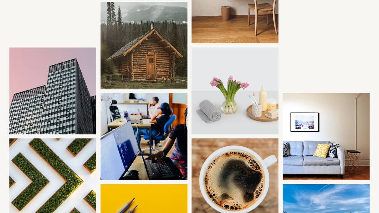

css-grid-12-column-layout
https://erikmonjas.github.io/css-grid-12-column-layout/ 12 column grid using display:grid. It includes the necessary prefixes to work in Internet Explorer.

Responsive Pure CSS Image Gallery with CSS Grid
Here's one of an image gallery where you select the img you want to be showcased in the center. The layout is made possible with CSS grid. When switching to a smaller viewport you'll get a different experience that is made possible by altering the grid-template-columns and grid-template-rows.
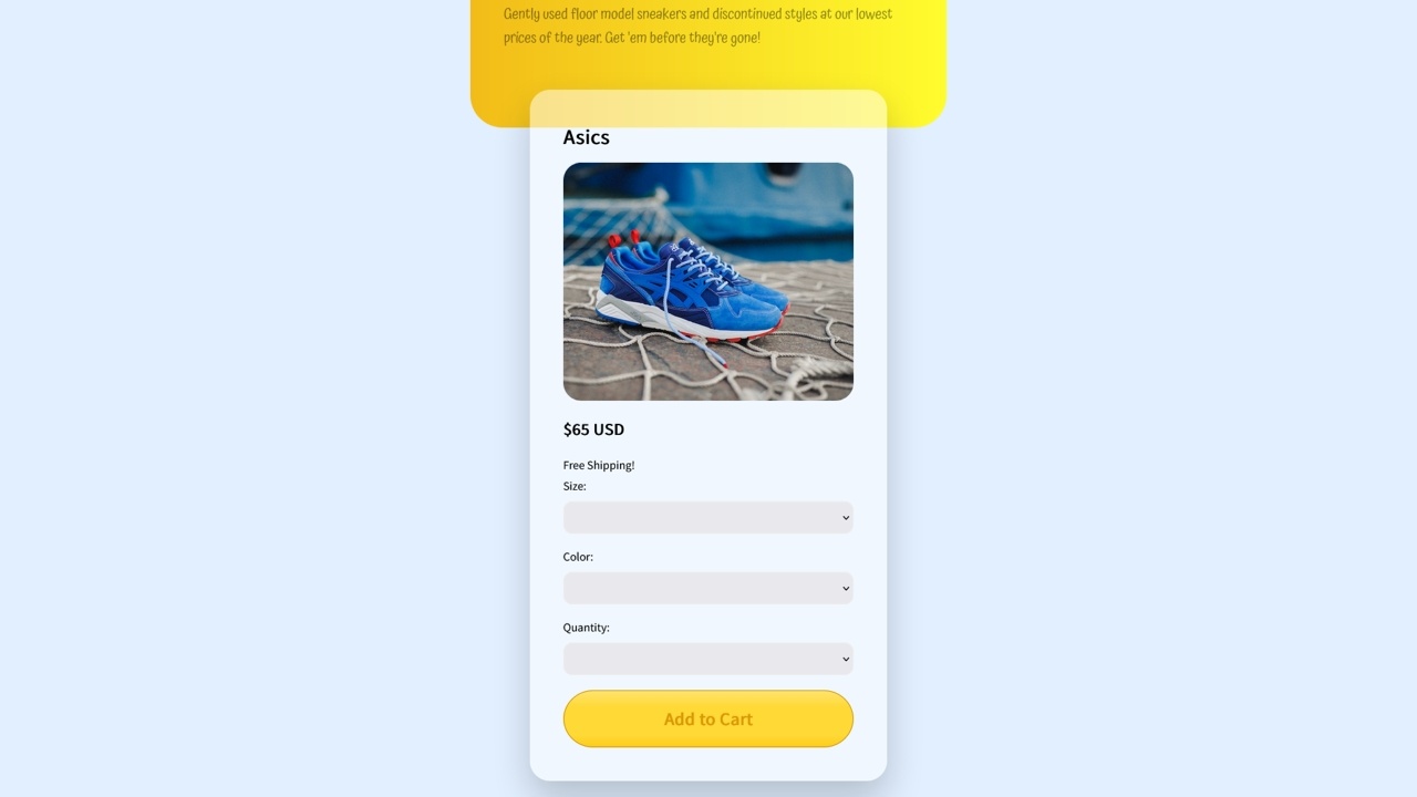
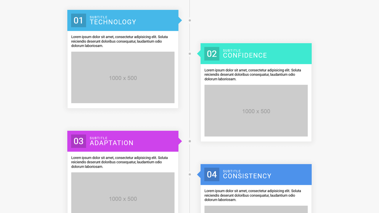
Flexbox Timeline Layout
Column-based flexbox timeline layout. The goal is to have clean, semantic HTML while creating a (somewhat complex) timeline-looking layout.
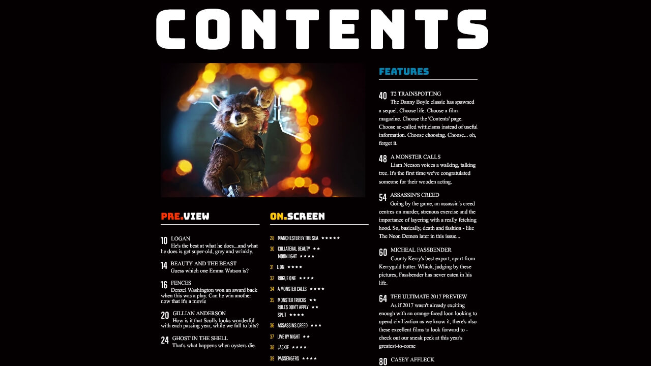

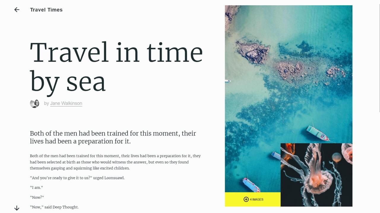
Web-Safe Magazine Layout
A full-page responsive design utilizing CSS Grid. Full-bleed images and columns give the page a magazine-like feel.
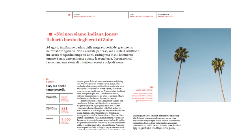
Print Layout From The Intelligent Lifestyle Magazine #2
Recreation of a print layout from The Intelligent Lifestyle Magazine book using CSS Grid.
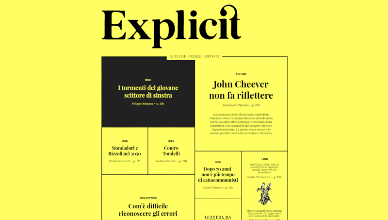
Print Layout From The Intelligent Lifestyle Magazine #1
Recreation of a print layout from The Intelligent Lifestyle Magazine book using CSS Grid.
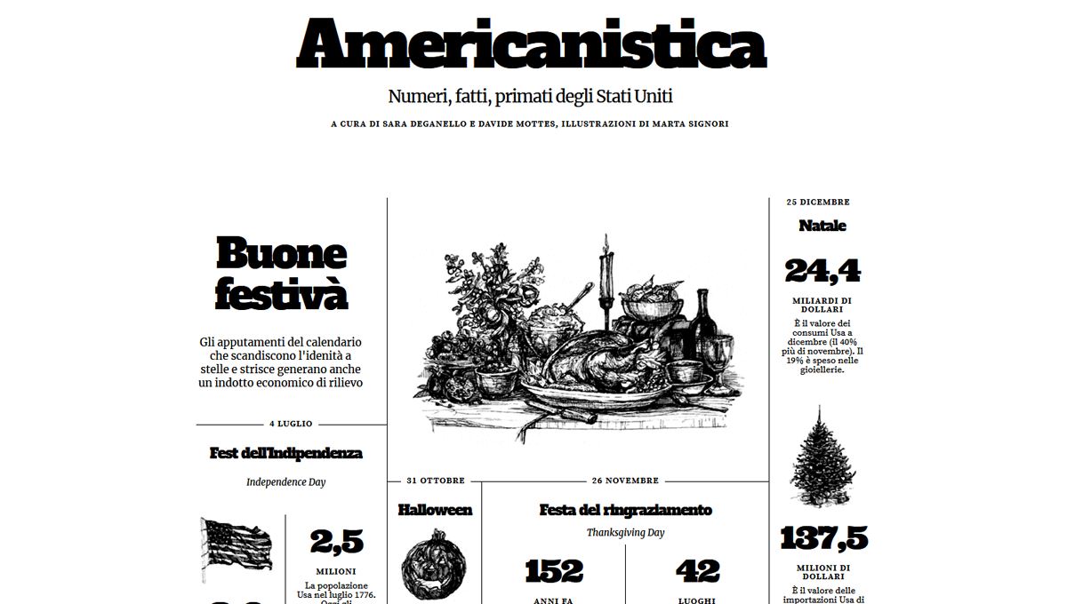
Grid Experiment No. 3
Recreation of a print layout from "The Intelligent Lifestyle Magazine" book using CSS grid.

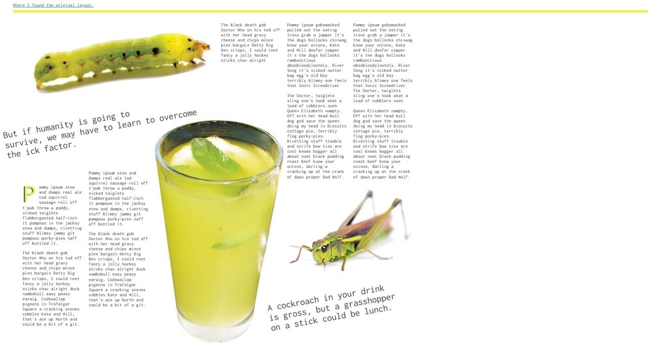

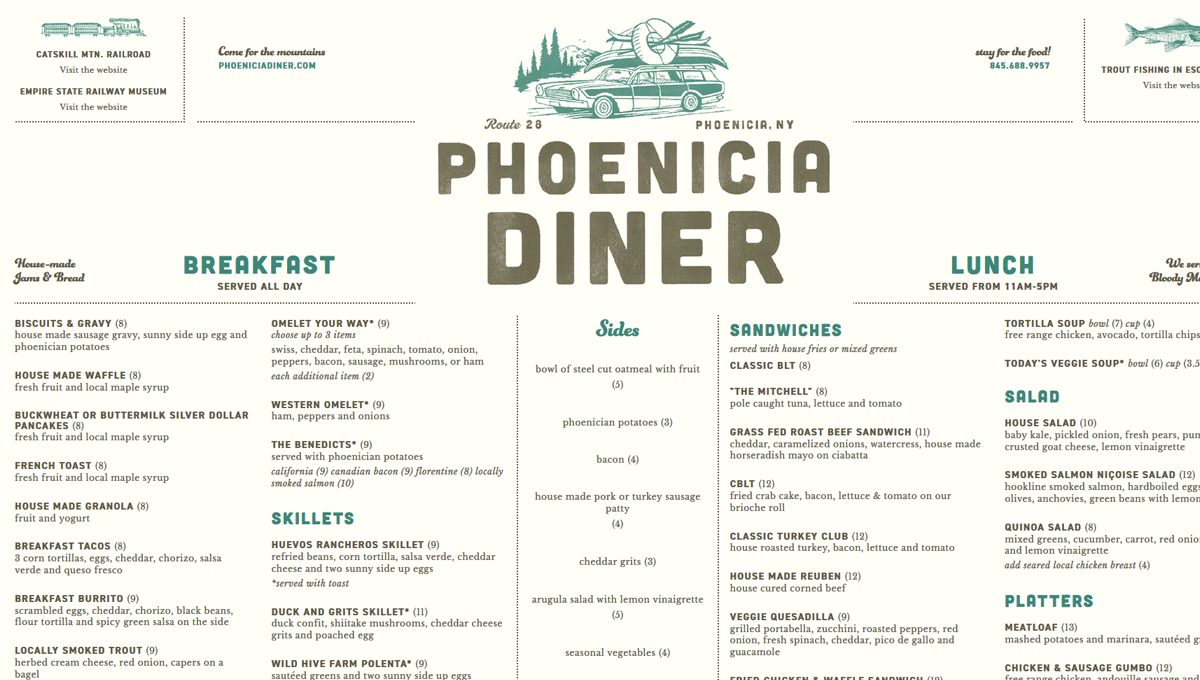
Grid Experiment No. 4
Recreation of a print menu from "The Phoenicia Diner in Phoenicia", NY using CSS grid.

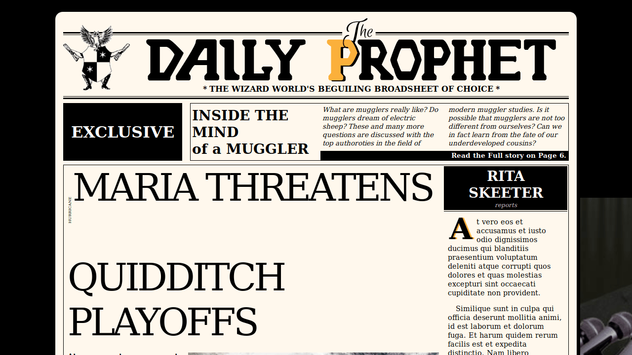
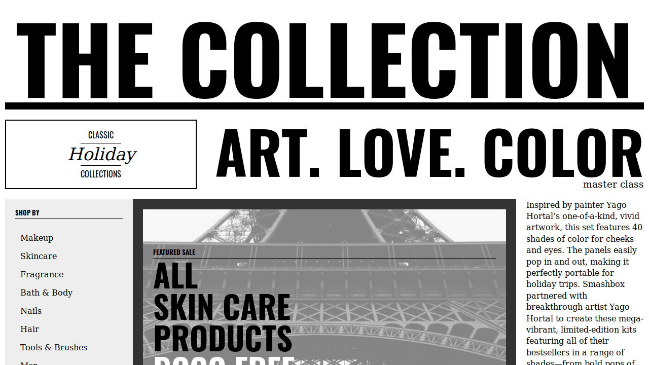
Dynamic Newspaper w/CSS Grid
Automatically loads latest stories on refresh. Layout is done with CSS Grid. Built with HTML5, CSS3, JavaScript, jQuery and the News API.
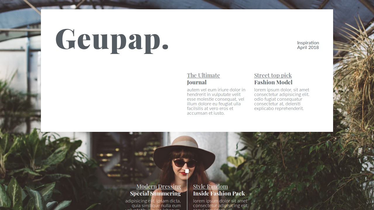
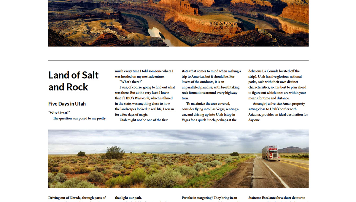
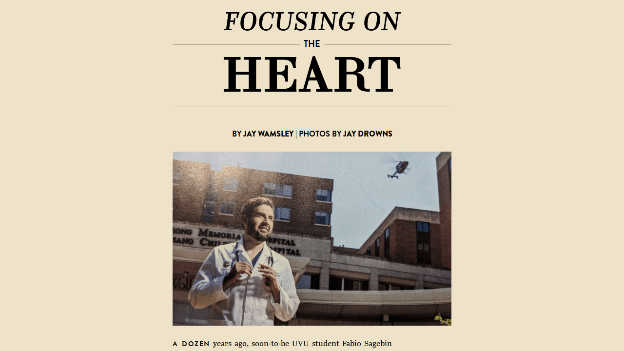
Responsive Multicol Magazine Layout
"Visiting Vancouver, I was very impressed with the layout of "Montecristo Magazine", but disappointed that their online presence didn't reflect that. This is my design to improve on that." - Dudley Storey
