Responsive CSS Grid Magazine Layout – 1

Responsive magazine layout using CSS Grid. Best viewed at 1280px.
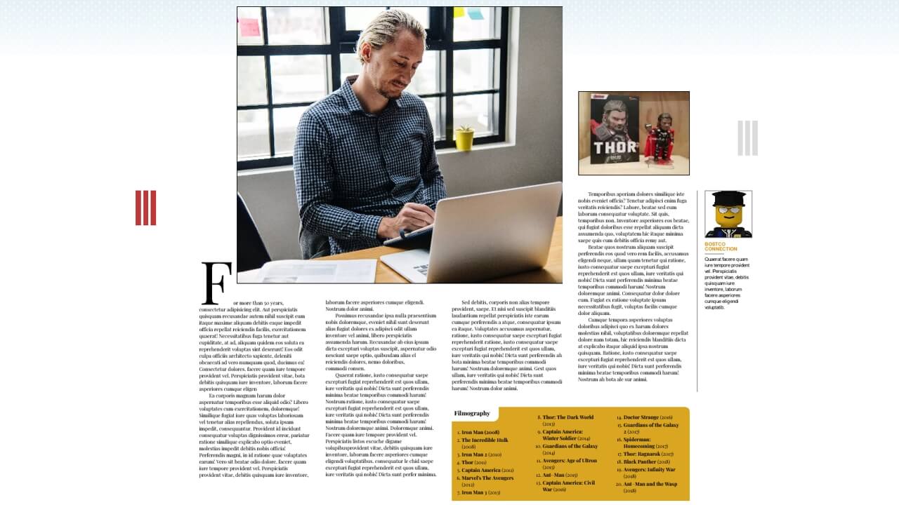
Visit

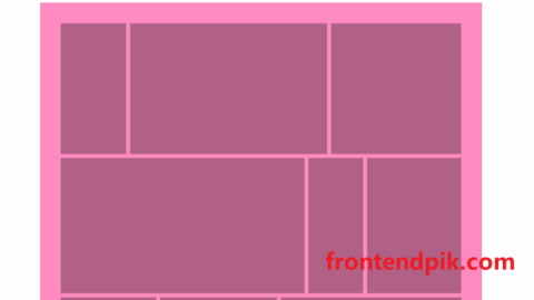
Responsive CSS Grid Magazine Layout – 2

Responsive magazine layout using CSS Grid. Best viewed at 1280px.
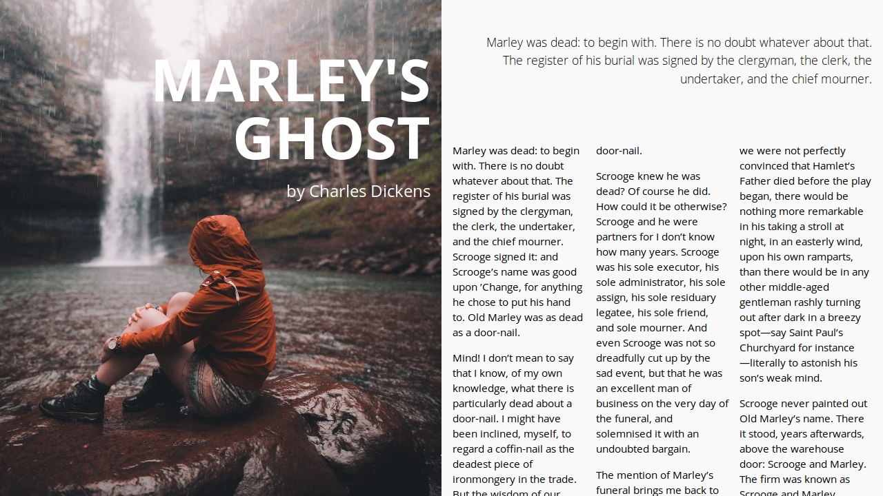
Visit

Full spread magazine layout

Full spread magazine layout - CSS Grid Layout
Visit

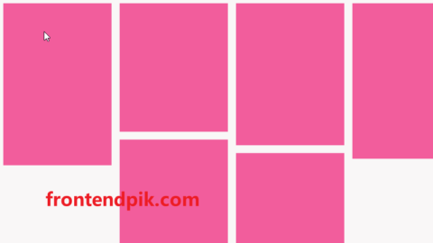
Magazine Grid Layout

Playing with CSS Grid & CSS Columns & CSS Shape Outside properties.
Visit

Fashion Isometric Gallery

Experiment for testing isometric ecommerce layout concept.
Visit

Responsive Comic Book Layout

A responsive layout using flexbox with narrative text and speech bubbles styled in CSS. Background patterns also in CSS. The only acceptable use of Comic Sans font.
Visit

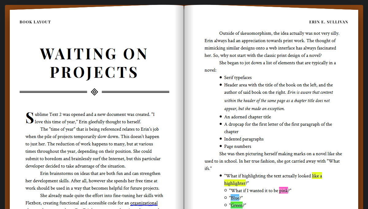
Book Layout

A responsive skeuomorph book layout, packed with fun little features.
Visit

Comic Book Style Layout

Good comic book style layout with CSS Grid.
Visit

Adaptive Photo Layout

Visit

CSS Grid: Responsive Masonry Layout

Visit

Water Bottle

Just some fun with backdrop-filter on a pure CSS cold water bottle. Thirsty yet? For some Firefox support, set layout.css.backdrop-filter.enabled and gfx.webrender.all to true in about:config, then restart the browser. However, the bottle may still not appear as expected.

Visit

Editorial Layout: Ansel Adams

Visit

Responsive Magazine Spread

Visit

Webflow-Style Email Input

Based on the input on https://webflow.com/cms. Changed to make use of pseudo elements and flexbox layout.
Visit

Magazine Grid Layout Vol. II

Visit
Creating A Flickr-style Justified Layout With JavaScript

justified-layout

Pass in box sizes and get back sizes and coordinates for a justified layout
Visit
Minimalist Grid Layout With Pure JavaScript – minigrid

minigrid

minigrid is a standalone JavaScript library used to generate a responsive, flexible, customizable grid layout for your next web design. Without the need of any 3rd dependencies like jQuery, etc.
Demo Visit

scrollable-tabs-bootstrap-5

A simple plugin to create scrollable tabs with Bootstrap 5.
Visit

Circular-Material-Menu

This is Circular Material Menu developed using HTML, CSS and JQuery
Visit

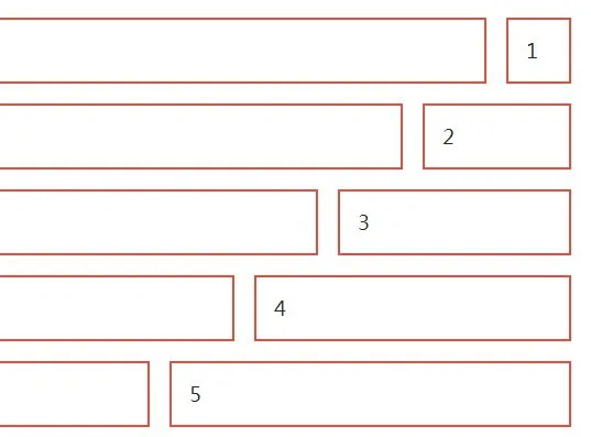
js-dynamic-image

Dynamic Image is a lightweight JavaScript library that dynamically swaps out the source of the image based on the viewport size. Great for responsive web layout to reduce the page load time and save the server bandwidth.
Visit

kindling-grid

A pocket-sized grid system built on the flex display property.
Visit

ungrid

ungrid - the simplest responsive css grid
Visit

fitter-happier-text

Performant, fully fluid headings
Visit

FluidFont

Responsive font made easy with JavaScript. No jQuery required.
Visit

strawberry

A new flexbox based CSS micro-framework.
Visit

bijou

A small (Less than 2kb) CSS framework
Visit

InContent

InContent is a pure CSS grid layout built with LESS/SASS for creating a responsive & animated image grid gallery that comes with lots of CSS3 based image caption hover effects like rotate, flip, slide, etc. It currently works perfectly on modern browsers that supports CSS3 transition and transform properties.
Visit

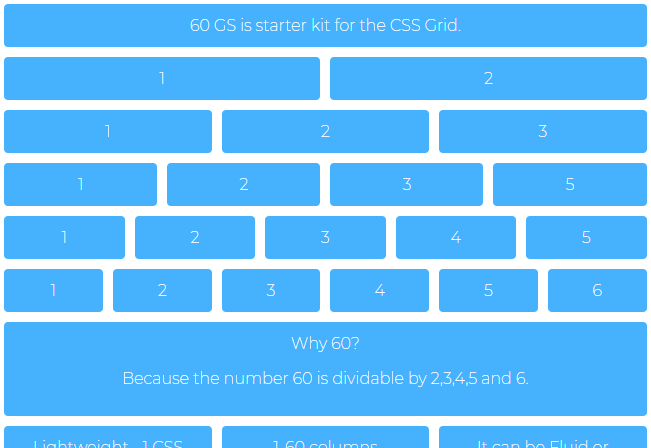
60gs

60GS - 60 Columns Grid System based on CSS Grid Layout
Visit

icecream

Simple and light responsive grid system
Visit

align.css

Easy css alignment. Pure flexbox
Visit
© 2025 FrontendPik